Here’s a very nifty infographic I came across in Google+ last week, posted by Chris Farinacci. It shows 38 Ideas for Using Google Drive in the Classroom.


Here’s a very nifty infographic I came across in Google+ last week, posted by Chris Farinacci. It shows 38 Ideas for Using Google Drive in the Classroom.
The Flappy Bird Triangle. Pick any two.
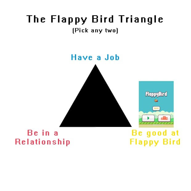
I saw a rough diagram similar to this floating around on le Facebook, so I thought I’d make a cleaner one. Enjoy! 🙂
Related links:
“What do pie charts, eclipses and redundancy have in common?”

For all Facebook Page administrators out there, here’s an interesting and useful graph showing Facebook Engagement by Post Type:


Yesterday, Google launched an interactive site that explains the life cycle of a Google search query, from crawling to algorithmic ranking to combating spam.
via Laughing Squid

Page [tcb_pagination_current_page] of [tcb_pagination_total_pages]